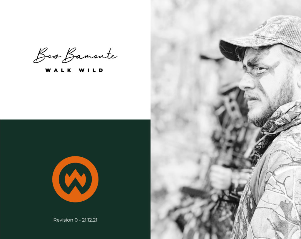
As a wilderness and outdoor guide, the developing of a mature, grounded and personal brand is the main priority. The branding must have a personal touch as it is a personal brand. The look and feel should be modern, and above the usual survival training camo style yoiu see a lot of in this field. Communication is important, and so text should be legible and easy to digest. Bringing in the use of orange would be great, as hunting courses use this as a way of bringing attention.
Once brand guidelines are established a full website where people can book courses will follow.
Designing a personal brand is a bit different. For Bow Bamonte we wanted to create something rugged and outdoorsy, but modern and mature.
For the Bow Bamonte Brand the colours represent the niche – wilderness guide, outdoors, nature, but the choice of greens are more mature, to represent the calm, mature nature of the courses. The vibrant orange contrasts the greens and provides a pop, the same way orange is used in hunting to make you stand out to other hunters. The use of orange should be for attracting attention, and should be used accordingly.
Brand messaging priorities are to be welcoming, personable and accommodating. For that reason Using a script font for the main logo delivers a personal hand signed touch, that signals personality, and connectedness with our clients.
The tagline “Walk Wild” can be seen in an uppercase wide spaced font to represent the bold, adventurous side of the brand.
As the main logo is entirely text based, a strong supporting icon is necessary to cement the brand. Thee iconography contains the two W’s from “Walk Wild”. It also suggests campfires, mountains, and a pitches tent, all of which are on brand.
Book a free consultation with Matt to speak about your project using Google Meet (no video if you prefer).
We’ll discuss the vision and goals for your project, and then follow up with a custom proposal.
or, shoot us a quick message